User Experience
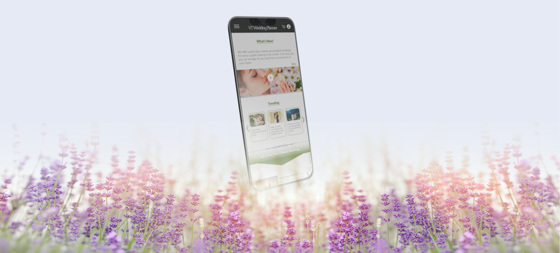
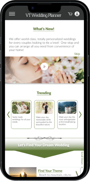
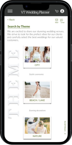
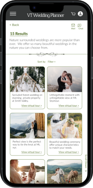
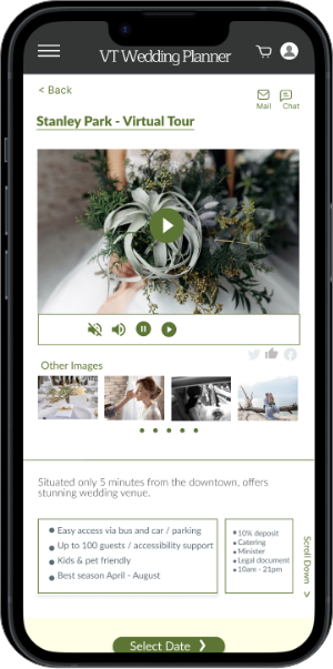
Virtual Tour Wedding Venue Search App
Project Goal
This app was designed using the same research, timeline, and core concept as the Virtual Tour Wedding Planner Website project.
The goal is to create a mobile app that allows users to explore wedding venues through virtual tours, access reliable venue details, and connect with a wide range of wedding service vendors — all in one place. Integrated features like vendor listings and a built-in payment system aim to streamline the planning process.
By enabling users to discover and book beautiful wedding venues from home, the app delivers a seamless, one-stop wedding planning experience with minimal effort.
- What
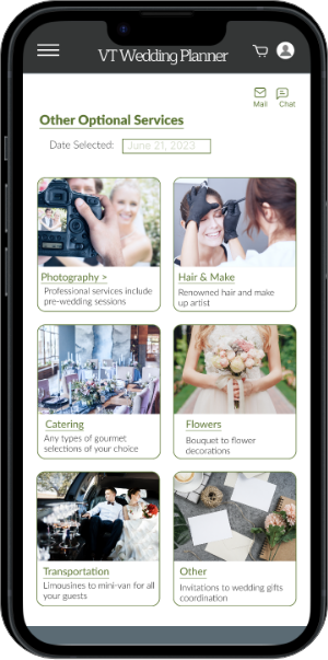
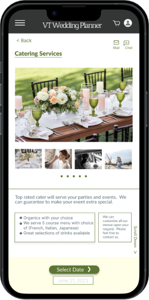
- A virtual tour wedding venue search website that allows users to explore and book wedding venues from any location. The platform also offers a range of related services through vendor partnerships, creating a seamless, one-stop wedding planning experience.
- My Role
- As the UX designer, I led the design of both the mobile app and responsive website — from initial concept and research through to prototyping, testing, and final delivery.
Design Process
Empathize & Define
- Problem Statement
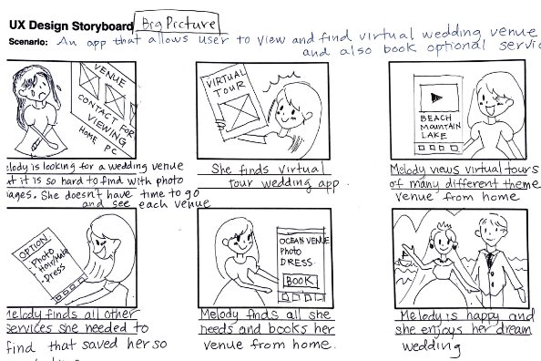
- Melody is a busy professional who needs easy, quick and reliable ways to plan a wedding because she has no time to physically visit multiple venue sites to check and individually arrange with wedding venders.
- Storyboard - Big picture
- For early stages of designing, series of panels that visually describe user’s experience to see potential solutions to a problem.
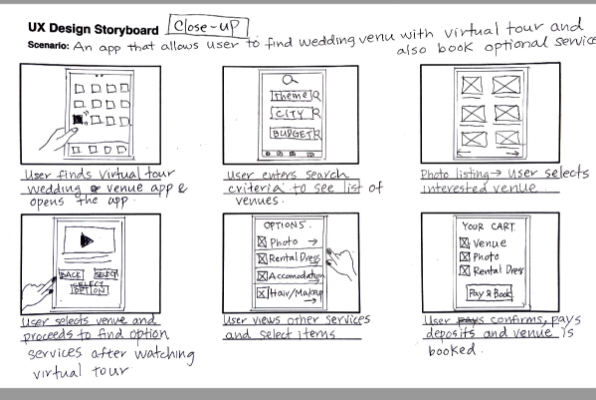
- Storyboard - Close-up
- Experience focuses on how the product works (what user does to transition one screen to another). The purpose is to understand the practicality of products.
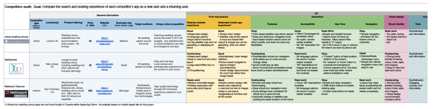
- Competitor Audit
- An audit of a few competitor’s products provided direction on gaps and opportunities to address with VT Wedding Planner app.
Ideate
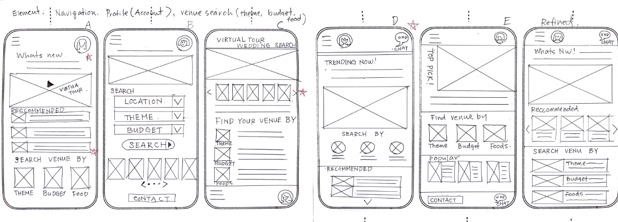
- Paper wireframes
- Ensuring that the elements that made it to digital wireframes would be well-suited to address user pain points. Final refined wireframe was derived by selecting various elements from draft designs.
Usability Study

Study type:
Moderated
Location:
Japan, remote
Participant:
5 participant
Length:
20-30 minutes
Study Findings
- Cue for Scroll Down
- Visible cue to “scroll down” for long list
- Add dedicated venue search page
- The “search” section is at the bottom of the home page. Make it more clear by creating dedicated venue search page.
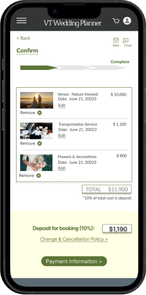
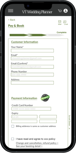
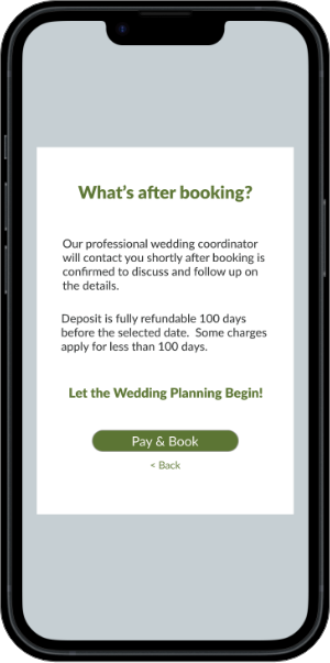
- Final payment popup screen is confusing
- Popup shows “back to home”. It is confusing to confirm the payment status. Make it more simple and clear.
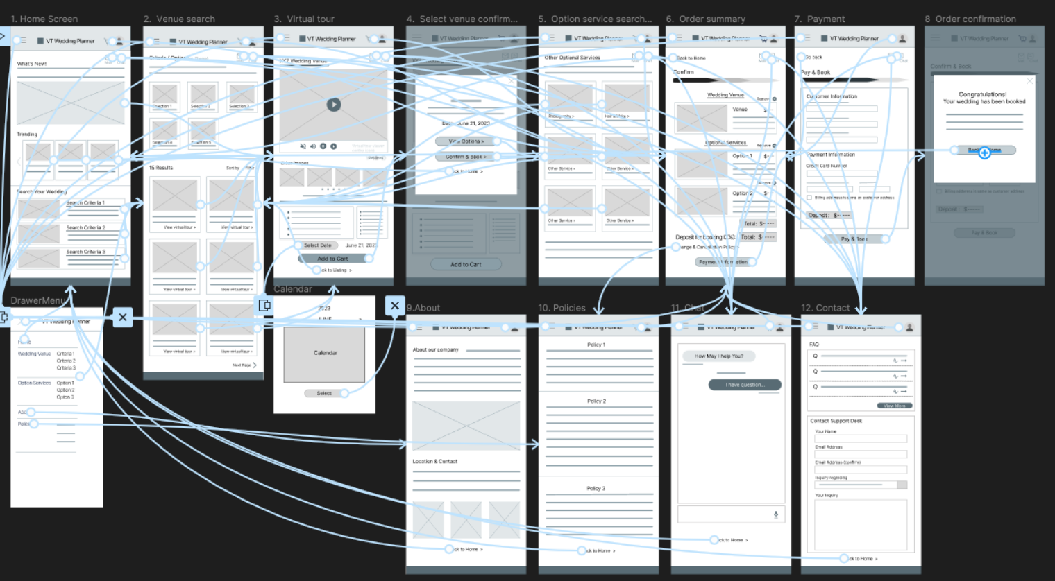
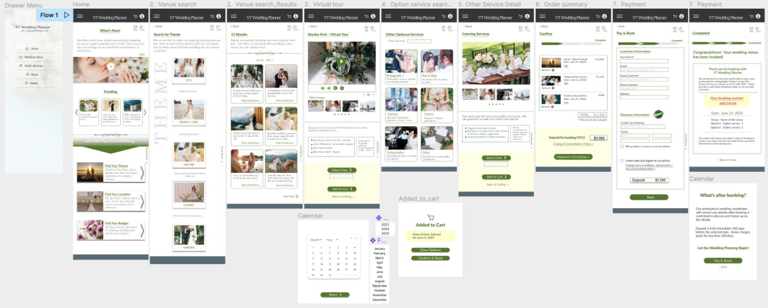
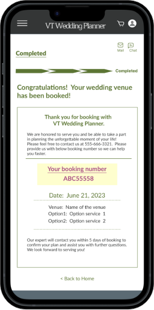
Hi-Fidelity Prototype
Hi-fidelity prototype includes clearer structure as suggested by usability study.
Thank you for checking out my work!
Responsive Web-Site
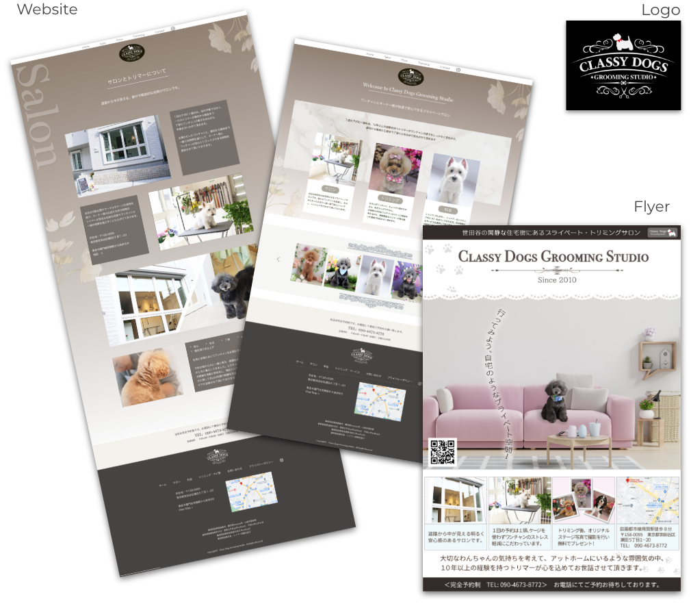
Classy Dogs Grooming Studio (New)

- Work:
- Logo design, website design, coding, WordPress custom theme development, user support, and ongoing monthly maintenance
- Project Type:
- Website renewal
- Client:
- Classy Dogs – a Tokyo-based grooming studio located in a luxury district, established in 2010
- Project-Highlights:
- The client requested a low-maintenance website that is simple, elegant, and easy to manage. While they expressed interest in starting a blog in the future, their current priority is to maintain a clean, informative site without the need for active marketing.
- Tools:
- Adobe XD, Dreamweaver, Illustrator, Photoshop, HTML, CSS, JavaScript, jQuery, PHP, WordPress
Key features include:
- This renewal focused on updating the website’s overall tone and content, including replacing dog photos throughout the site to better reflect the studio’s current clientele and services. The goal was to simplify the website into an informational platform rather than a promotional one.
- The client was not seeking to attract a large number of new customers, but rather to maintain and strengthen relationships with existing clients by offering a clear, reliable online presence.
- Located in Tokyo’s upscale Setagaya area, the salon specifically targets middle-aged women living nearby. While the website remains purposefully minimal in marketing content, promotional flyers were also created to encourage repeat visits and reinforce customer loyalty.
Responsive Web-Site
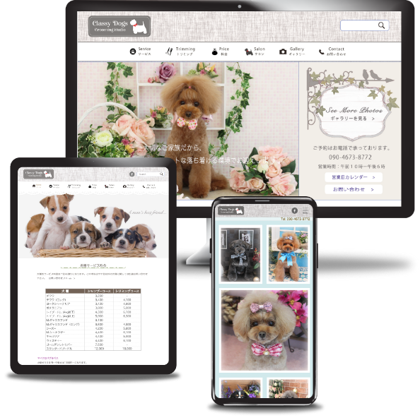
Classy Dogs Grooming Studio (Original)
- Work:
- Site design, coding, custom WordPress theme setup, user support, and ongoing monthly maintenance.
- Project Type:
- Newly launched website for a first-time storefront
- Client:
- Small business: A Tokyo-based grooming studio in an upscale neighborhood, established in 2010.
- Project-Highlights:
- As a startup business, the client aimed to grow their customer base with an SEO-focused and visually appealing website. A dedicated gallery page was created to highlight ‘after’ images of groomed dogs, emphasizing the quality of service.
- Tools:
- Adobe XD, Dreamweaver, Illustrator, Photoshop, HTML, CSS, jQuery, PHP, WordPress
Implementation note:
The client promoted the store through various external media channels, directing traffic to the homepage. Strategically placed CTA buttons across the site supported effective new customer conversion.
Responsive Web-Site
MB Independent Property Assessment
- Work:
- Logo design, full site design, multi-site setup, custom WordPress theme development, coding, and user support.
- Project Type:
- New corporate site
- Client:
- A small investment consulting firm in Japan aiming to expand services to foreign nationals.
- Project-Highlights:
- Primary site language set to English, with a Japanese subdirectory for local users.
Implemented a mail magazine (email newsletter) system, a key client requirement to attract new users and share investment insights for credibility-building.
- Tools:
- Adobe XD, Dreamweaver, Illustrator, Photoshop, HTML, CSS, jQuery, PHP, WordPress
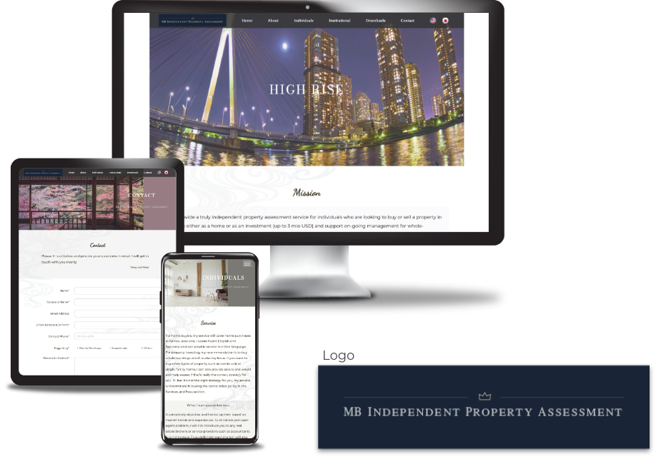
The business has been discontinued (site no longer live)
Responsive Web-Site
Lawyer Fujiyoshi's Official Site
- Work:
- Site design, coding, WordPress custom theme setup, user-assistance
- Type:
- New personal site setup
- Client:
- Well established lawyer, tax accountant, and YouTuber (2,140k subscriber as of Oct. ’24)
- Project-Highlights
- The client owns and manages multiple social media platforms, including YouTube, X (formerly Twitter), Facebook, and TikTok, in addition to running his own law firm. The website is designed to guide viewers to these external channels, with a particular focus on showcasing the latest content from YouTube and X—where the client has a substantial following. Live feeds from both platforms are embedded on the homepage to highlight their importance.
- Tools:
- Adobe XD, Dreamweaver, Illustrator, Photoshop, HTML, CSS, jQuery, PHP, WordPress
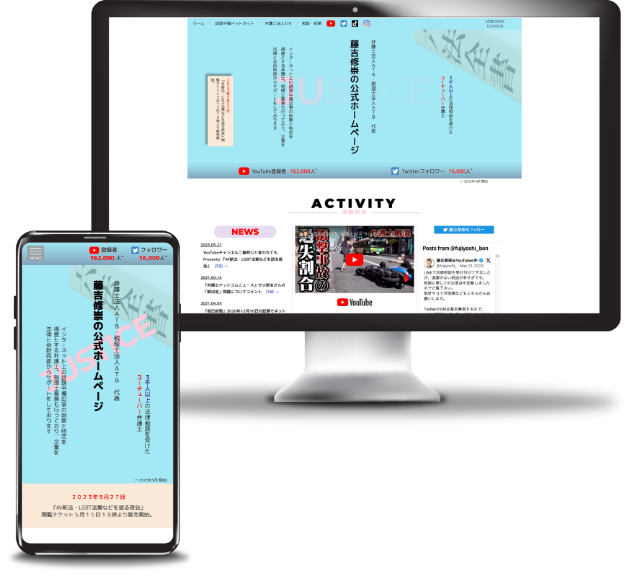
Implementation note:
The primary focus of the site is to showcase direct feeds from the client’s highly viewed social media channels, including YouTube (214k subscribers) and X (formerly Twitter, 26k followers). Live feeds from both platforms are embedded on the homepage.
Responsive Web-Site
Tsukuba Asset Management Company
- Work:
- Design, coding, WordPress custom theme development, and user support
- Project Type:
- First-time corporate website
- Client:
- A judicial scrivener expanding into the asset management sector
- Project-Highlights:
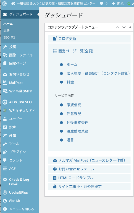
- Setup of a blog section, multiple plugins (mail magazine, site security, SEO), slide animations and other jQuery-based effects, logo vectorization
- Tools:
- Adobe XD, Dreamweaver, Illustrator, Photoshop, HTML, CSS, jQuery, PHP, WordPress, Canva
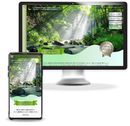
Key features include:
- Easy and intuitive navigation tailored for older users
- Clear and simple call-to-actions to support user conversion
- Custom blog setup, enabling the client to regularly share educational content and introduce relevant services
- Custom blog setup as client hopes to continue educate viewers and introduce various suitable services.
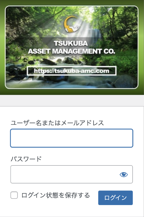
- User-friendly content management interface designed for non-technical users
- Customized WordPress login and dashboard to ensure secure and straightforward site maintenance
Graphic Design
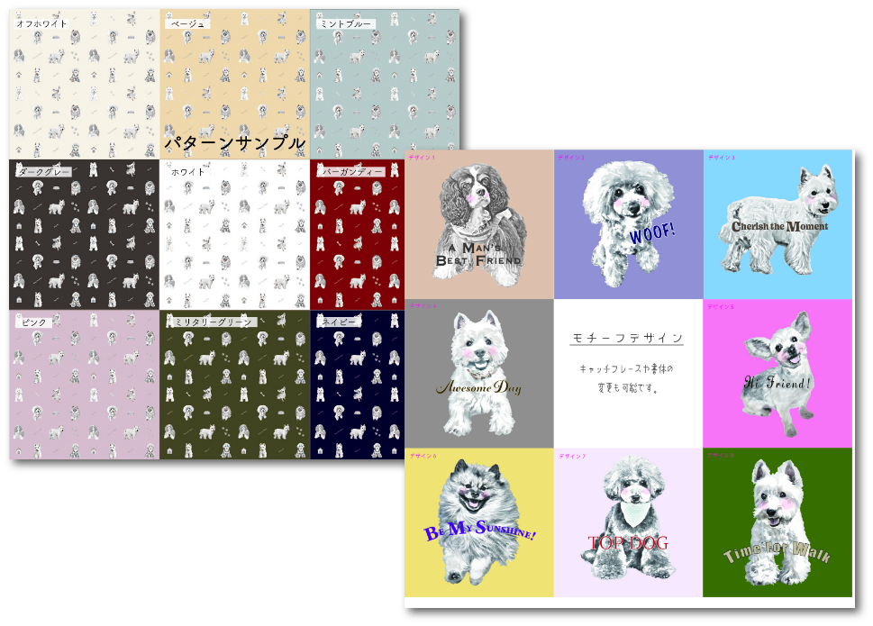
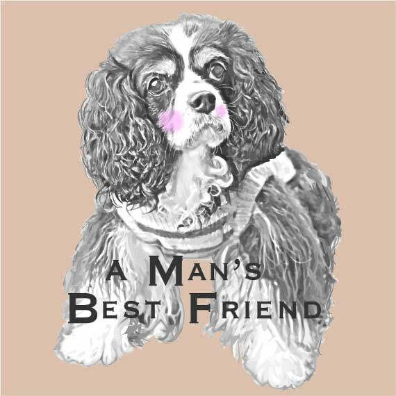
Pet Products Fabric Design
- Work:
- Design applications through CloudWorks
- Project Type:
- The company selected 4 standout designs from a pool of approximately 30 entries — my dog-themed design was among those chosen.
- Client:
- Japanese pet goods manufacturer seeking original fabric designs for pet carriers and related accessories.
- Tools:
- Adobe illustrator & photoshop
Graphic Design
Brand Identity: Taylor Chen Golf Instructor
- Work:
- Clean & scalable: logo design and vectorization
- Project Type:
- Logo & identity design for a professional golf instructor’s new brand launch
- Client:
- An established professional golf instructor aiming to grow his private lesson business.
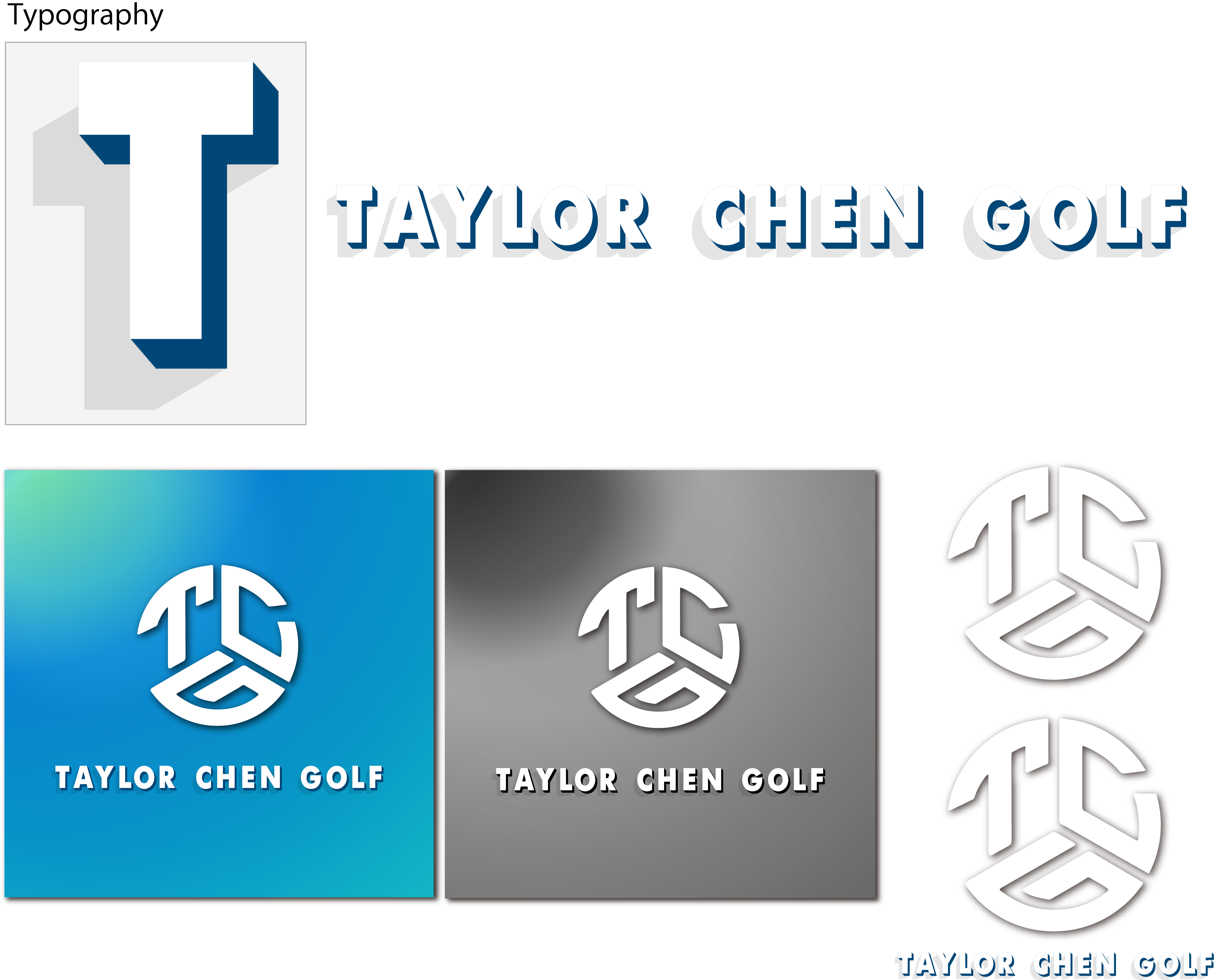
Implementation note:
Starting from the client’s initial sketch, I crafted a range of color and typography options to capture the look and feel he envisioned for his brand.
Responsive Web-Site
Hibouchushou.net
- Work:
- Design, coding, WordPress custom theme setup, user-assistance
- Type:
- Site renewal / DNS and server change / transferring over 100 blog articles
- Client:
- Established law firm’s primary business department
- Project-Highlights:
- CTA driven conversion focused site. Site images generated using AI (Adobe firefly).
- Tools:
- Adobe XD, Dreamweaver, Illustrator, Photoshop, Firefly, HTML, CSS, jQuery, PHP, WordPress
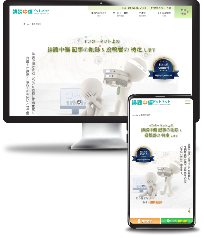
Key features include:
- A law firm specializing in defamation, libel, and slander cases, with a strong focus on improving client conversion.
- Short and simple CTA text with design that easily grabs viewer’s attention.
- CTA buttons are strategically placed in various areas throughout the site.
- Increased focus on mobile viewers that required simple and more intuitive designs.
- The previous site contained numerous broken links within blog articles and was using outdated plugins. These issues were thoroughly reviewed and addressed to ensure functionality and improve overall site stability.
- Custom WP login & dashboard for safe and easy maintenance
- Installation of proxy/VPN blocker that greatly helped clients’ overwhelmingly large number of Spam bot attacks.
- Migrated and updated over 100 blog articles, ensuring consistency and ease of future maintenance.
Responsive Web-Site
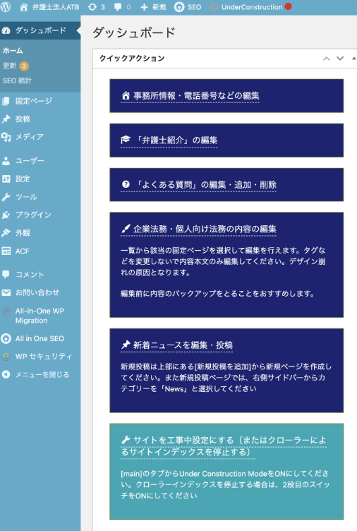
ATB Law Firm
- Work:
- Design, coding, WordPress custom theme setup, user-assistance
- Type:
- Home page renewal / DNS and server change
- Client:
- Established law firm with headquarter in Tokyo
- URL:
- https://ben-atb.jp
- Project-Highlights:
- CTA driven conversion focused site. Site images generated using Adobe Firefly.
- Tools:
- Adobe XD, Dreamweaver, Illustrator, Photoshop, Firefly, HTML, CSS, jQuery, PHP, WordPress
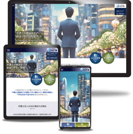
Key features include:
- The client requested to make an unique eye-catching corporate site (previous site was “too boring”) .
- Easy and simple navigation
- Simple and effective CTA to drive conversion
- Primary focus on mobile viewers
- Setup custom input for easy update as previous site was not updatable without use of HTML.
- Custom WP login & dashboard for safe and easy maintenance