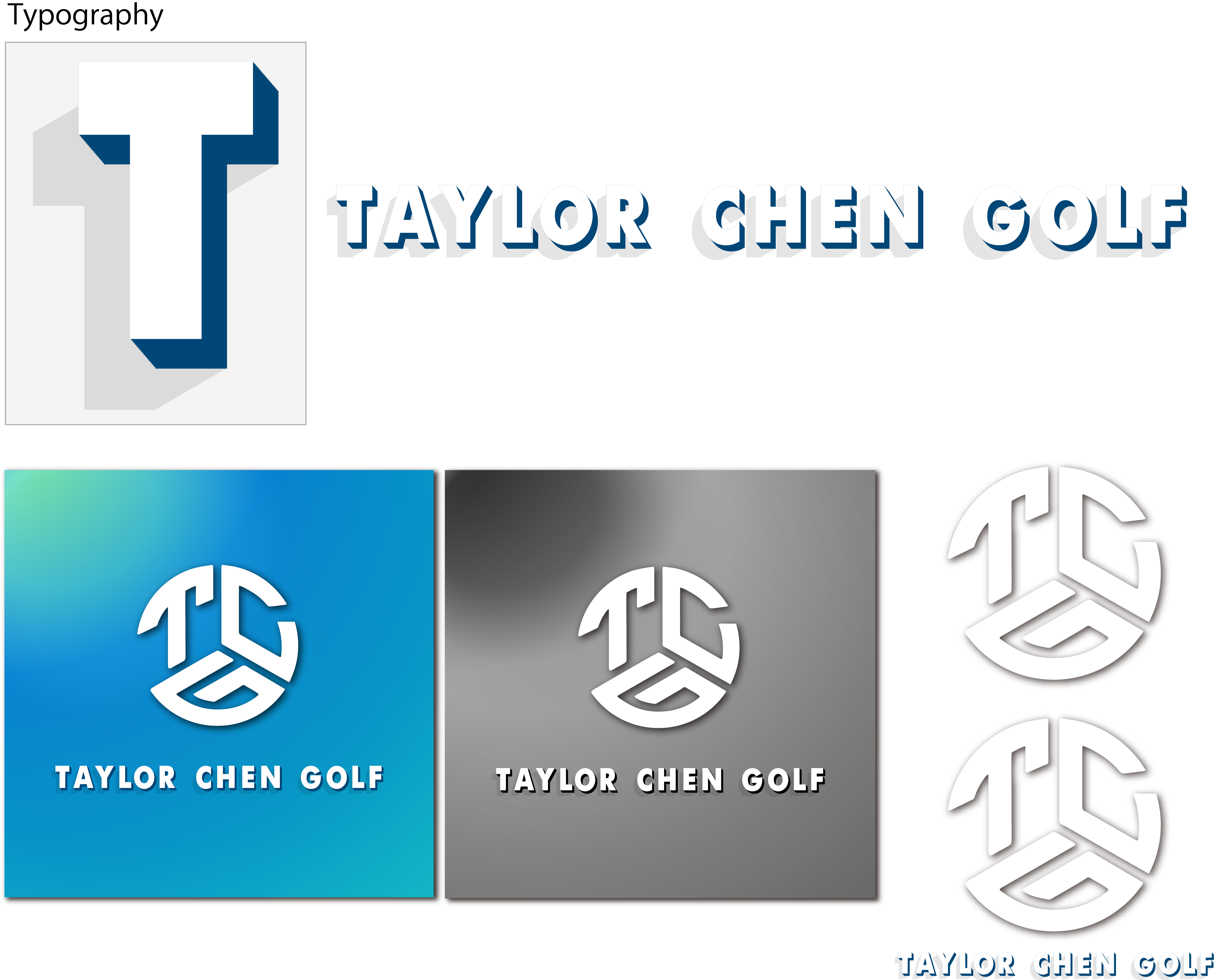
User Experience
- What
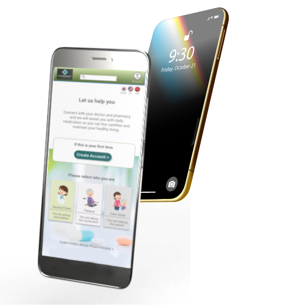
- Designing a prescription medication ordering app that helps people stay on top of their medications with ease. By simplifying the ordering process and providing smart reminders, the app empowers users to manage their health effortlessly — supporting a carefree and independent lifestyle.
- Where & Who
- Developed for the Japanese market, serving users across all age groups — with a particular focus on seniors aged 60 and above. As Japan’s aging population continues to grow, we aim to support both older adults and their families by providing accessible, reliable tools for medication management.
- When
- March 2023 to May 2023
- My Role
- UX designer leading the app and responsive website design from conception to delivery.
- How
- I led a user-centered design process that began with research and user interviews to understand real-world needs. From there, I created both paper and digital wireframes, followed by low- and high-fidelity prototypes. I conducted usability testing, prioritized accessibility, and continuously iterated on the designs to ensure a simple, intuitive experience for users of all ages.

Research Summary
- Research revealed two main user groups: middle-aged adults caring for elderly family members, and seniors managing their own medical conditions. Both face stress related to medication management. Existing apps often lack multilingual support, a key issue as Japan brings in more foreign caregivers under government programs, highlighting the need for a more accessible and inclusive solution.
Project Goal
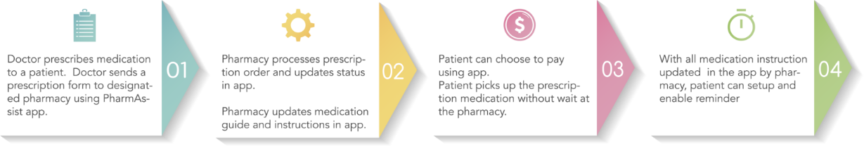
- Streamline Communication: Connect doctors, pharmacies, and patients through an integrated platform that simplifies prescription ordering and refill processes.
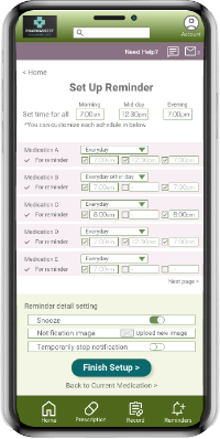
- Support Medication Adherence: Enable users to easily set up personalized medication schedule notifications.
- Promote Independence & Reduce Caregiver Load: Empower individuals who require regular reminders to manage medications independently, while easing the burden on caregivers and family members.

Constraint & Challenges
- Japan’s aging population presents a growing healthcare challenge, and this app aims to help alleviate that burden. This project was deeply personal, inspired by my own experience seeking support for a family member facing medical issues. Based in Canada, I faced logistical difficulties conducting usability testing in Japan. Testing with seniors — some with dementia — required moderated, in-person sessions, which I coordinated remotely through on-site assistants. Additionally, many seniors had limited IT literacy, making basic actions like clicking, scrolling, or tapping unexpectedly difficult. These tasks had to be clearly defined and carefully introduced in the design process.
Design Process
Empathize & Define
- Problem statement
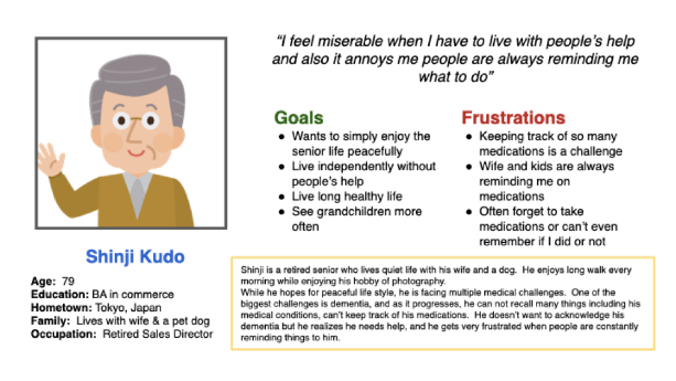
- Shinji is a medically challenged senior who needs reminder to take medication but does not like to be told each time by someone because he wants to live independently without others’ help
- Problem statement
- Rei is a housewife who cares for her family and looks after her medically challenged mother, needs some help reminding her mother to take medications 3 times a day because she wants to have some break and relax.

Ideate
- Competitor Audit
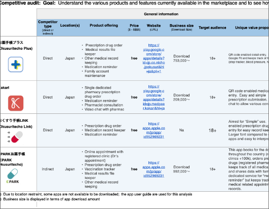
- An audit of a few competitor’s products provided direction on gaps and opportunities to address with PharmAssist app.
Ideation exercise to come up with ideas for how to address
gaps identified in the competitive audit.
- Low-Fidelity Prototype
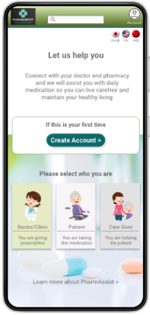
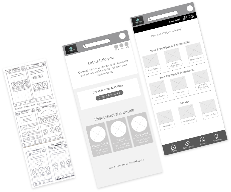
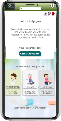
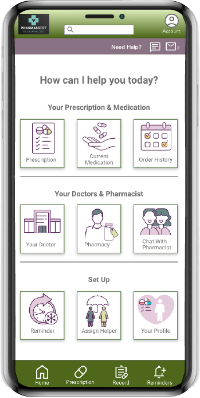
- The home screen for patients and caregivers are designed to be simple and easy. Menus are all displayed in form of icon. All elements in the app are displayed at above the fold.
Initial Concept
Fist screen is designed to direct different users for different usability specification. Use icons and less texts for “simple” and “easy” concepts.
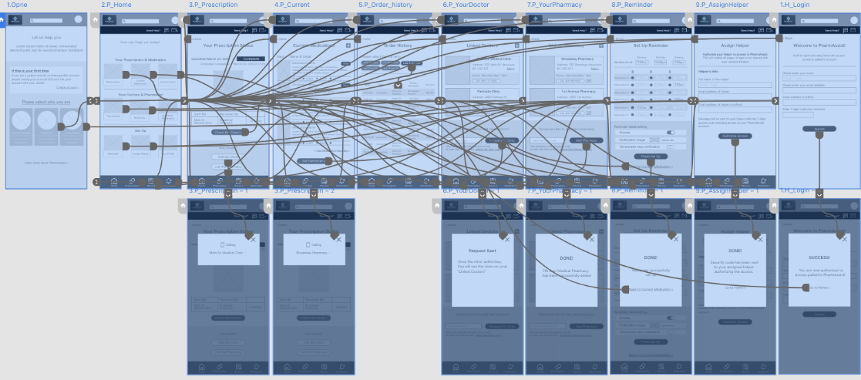
Basic Process Flow
Usability Study

Study type:
Moderated
Location:
Japan, remote
Participant:
5 participant
Length:
20-30 minutes
Affinity Diagram

Study Findings
- Scroll & Swipe
- Scroll and swipe are difficult. Keeping all elements above the fold and interaction triggers to "tap" only was relevant
- Texts & Readability
- Details tend to be skipped (not read). Making links like “view more” and improve readability
- Navigation
- Options to navigate in multiple ways. Easy navigation for going back, or finding item as users tend to get lost by incorrect tapping
Hi-Fidelity Prototype
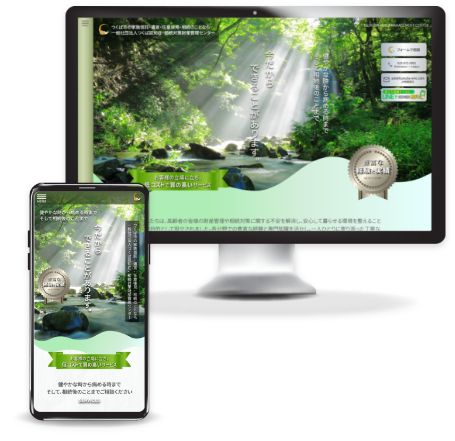
Responsive Website Design
The designs for screen size variation included mobile, tablet, and desktop. Designs are considered based upon specific user needs.
- Mobile
- Tablet
- Desktop

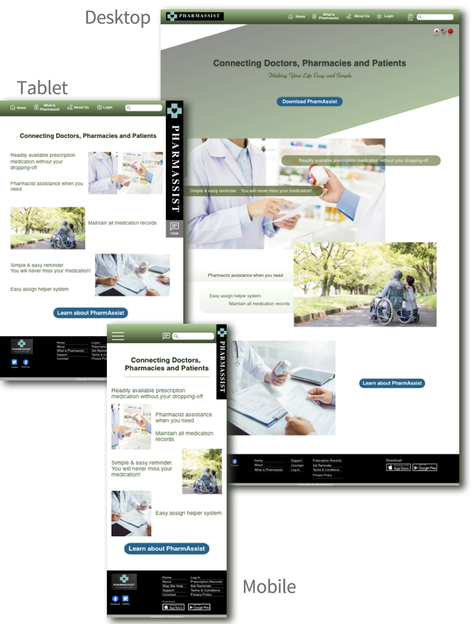
Key Considerations
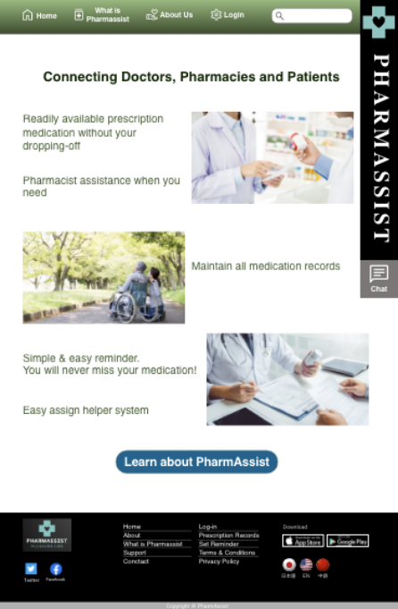
Website is aimed to help people that are looking for help either for themselves or for someone else. The site provide key information source and detail of the app, providing links to PharmAssist app.
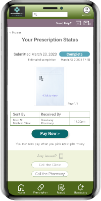
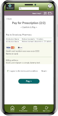
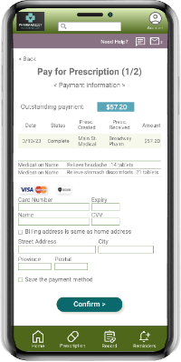
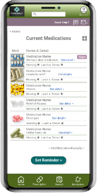
- PharmAssist App
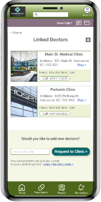
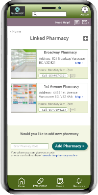
- Connects doctor-pharmacy-patients
- Prescription medication order & payment system
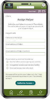
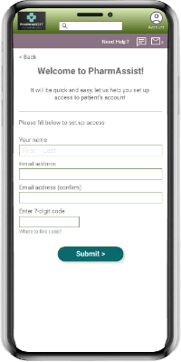
- Medication schedule notification system Access shared with designated helpers
- Responsive Website
- Information source and overview of PharmAssist app
- Access point to download PharmAssist app
- App user guide
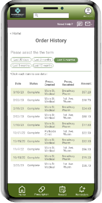
- Prescription history download site medication notification setup
Thank you for checking out my work!